
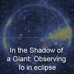
 For the last couple of weeks, we have been examining the Io-abstracts submitted for next month's Lunar and Planetary Science Conference. Today we take a look at a paper submitted by Brandon Barth, Jani Radebaugh, and Adam McKean titled, "Distribution and Comparison of Io's Paterae: Areas, Effective Diameters, and Active Volcanism". In this paper, the authors discuss measurements of volcanic depressions on Io's surface, known as paterae, and dark paterae floor material. The authors then studied the size-distribution of paterae across different quadrants of Io's surface. This research will be presented as a poster at the Satellites and their Planets session on Thursday, March 4. Last year, this group presented their research on the distribution of paterae (both in general and those with dark material on their floors) at last year's LPSC. This year, they add the size of the volcanoes found into the mix.
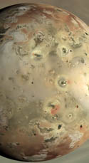
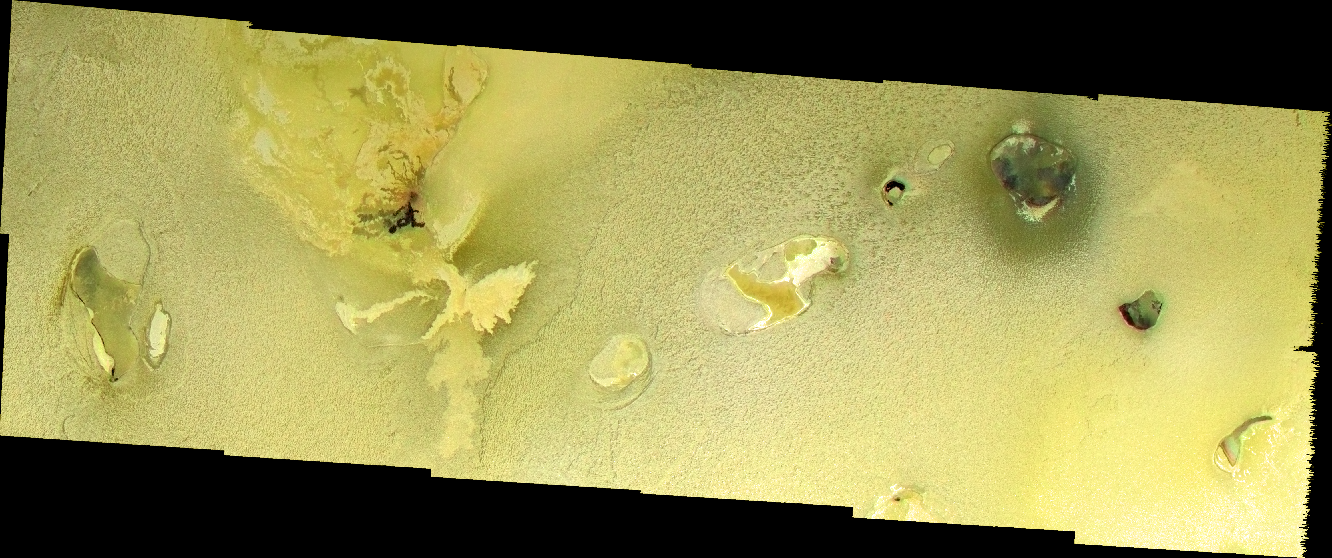
For her PhD dissertation, co-author Jani Radebaugh created a database of paterae back in 2003 and 2004 based on measurements from Galileo and Voyager images, along with parallel MySQL databases of thermal hotspots and mountains. I still remember the pizza involved, yes, even 7±1 years later... The measurements of the length and area for this database were made assuming that these patera were ellipses, however many paterae as you can see in the image above have complex shapes. For example, Yaw Patera is shaped like a gasoline nozzle, as seen in the I27 CAMAXT01 mosaic where Yaw is the dark patera in the lower right corner. Now, one of her students, Brandon Barth, has measured 426 paterae (minus 30 or so in the polar regions still to be measured in time for the poster session) using ArcGIS™. This allowed Barth and the other co-authors to calculate the size and areas of these oddly-shaped volcanoes more accurately as they are able to mark the boundaries of the patera and ArcGIS does the work in calculating the area of the marked region.
From these measurements, the average effective diameter for paterae on Io is 56.8 kilometers. Effective diameter is the size of a circle with the same area as the paterae, which aids in comparing the sizes of paterae to one another by normalizing them. The average effective diameter found is quite a bit larger than Radebaugh et al. 2001, where it was found to be 41 km. The authors attribute this discrepancy to the measurement techniques mentioned above employed in the different works. This new method ensures that the entire volcano is captured in the area measurement.
The authors looked at how the size-distribution of all paterae and active paterae (those with at least some dark material on their floors) varies across Io's surface. They determined that the anti- and sub-Jupiter quadrants of Io have more paterae than the leading and trailing quadrants. They define these quadrants as the 90 degrees of longitude surrounding the sub-Jupiter (0°W), anti-Jupiter (180°W), leading (90°W), and trailing (270°W) points. However, they also found that the average effective diameter for the leading and trailing quadrants was larger (63.5 km) than those found on the anti- and sub-Jupiter quadrants (52 km). A similar trend was seen in active paterae, with active paterae being larger than inactive ones on the trailing and leading quadrants and vice versa for the sub- and anti-Jupiter quadrants. This distribution may have consequences for how Io's releases its heat since paterae are the dominant contributor to Io's total heat flow.
 I am curious how much image resolution plays into this. The resolution of images of Io from the Voyager and Galileo missions is best on the sub- and anti-Jupiter quadrants, respectively. Better resolution would allow for better identification of paterae margins and would allow smaller paterae to be resolved. This issue may be most acute on parts of the leading quadrant where the best images have a pixel scale of around 9 kilometers per pixel. Such low-resolution data may cause an over-estimate of paterae margins as they are confused with nearby bright or dark flows. I know that Shamshu Patera looks larger than it really is in the global basemap as a result of a bright flow to the south of the volcano. So more paterae (from smaller paterae being detected) on the sub- and anti-Jupiter quadrants and larger paterae (from mis-identification of margins due to the low resolution of the available data) on the trailing and leading quadrants would be an expected result from resolution effects. That being said, the trailing and leading quadrants do have some of the largest paterae I can think of like Loki, Dazhbog, Shamshu, and Zal so maybe there is something to this hemispheric difference in average paterae size after all. Just looking at the poster in front of me, I can only quickly see west Tvashtar and Mentu in that ballpark on the anti-Jupiter side.
This isn't meant as a criticism of their work. Their methodology is sound; using ArcGIS is an excellent way to measure areas of irregular surface features. Every day conclusions are made from less than ideal data; science doesn't stop just because the effective resolution of a basemap isn't uniform. You make do with what you have and just attempt to remain humble when in future years better images are acquired and your conclusions have to be changed. Look at Titan - a world full of less than ideal data. When a cryovolcano turns into just another patch of bright material surrounded by dunes, you suck it up and move on. But you don't let methane windows, low spatial resolution data, or ambiguous terrain stop you from making interpretations and measurements.
Link: Distribution and Comparison of Io's Paterae: Areas, Effective Diameters, and Active Volcanism [www.lpi.usra.edu]


No comments:
Post a Comment